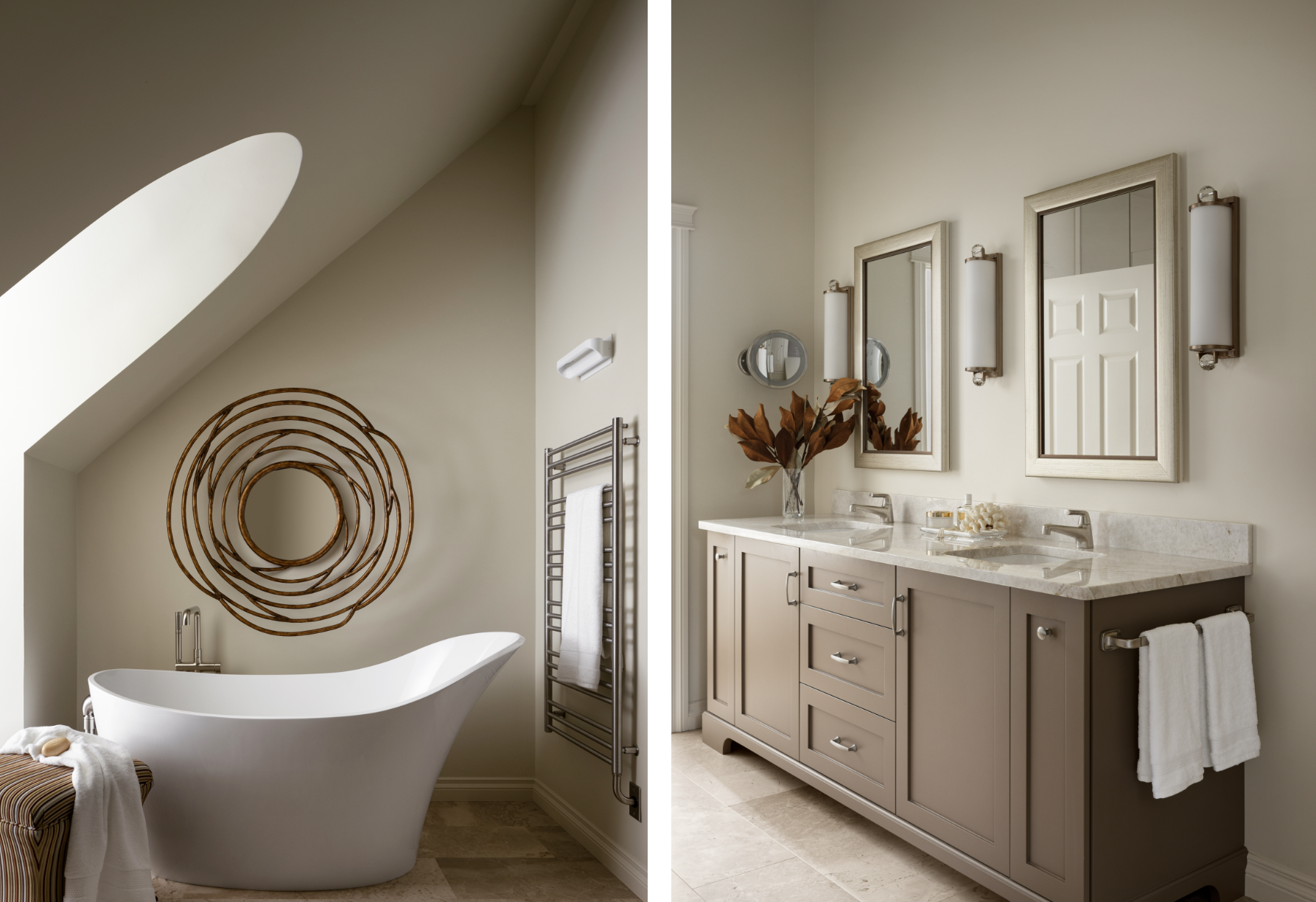
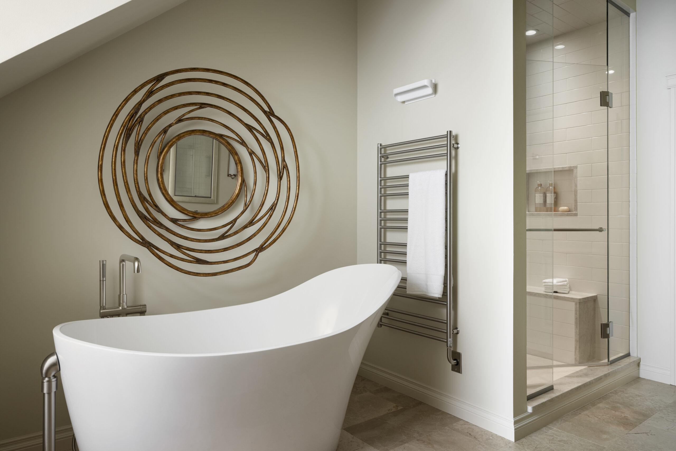
Our ensuite bath is a stunning refuge where we take pleasure in a relaxing soak at the end of a hectic day.
My client requested a calm sanctuary, so I started with a subtle colour palette, added white fixtures, and completed the look with simple brushed nickel fittings. To then take this look to the next level, I brought in a burnished bronze mirror, placed over the free standing tub. I love mixing metals, and in this space, the burnished bronze brings warmth and an organic feel, which is enhanced by the twig like appearance of the frame. The natural stone tile in a large format size emphasizes both the calmness of this space as well as the importance of nature, with the variations in colour and pattern adding to the organic feel. The tub is a sculptural element in the room with its soft, curved lines mirroring the lines of the arched window. The overall aesthetic is timeless: a sanctuary for relaxing, reflecting, and restoring.
Elbow park
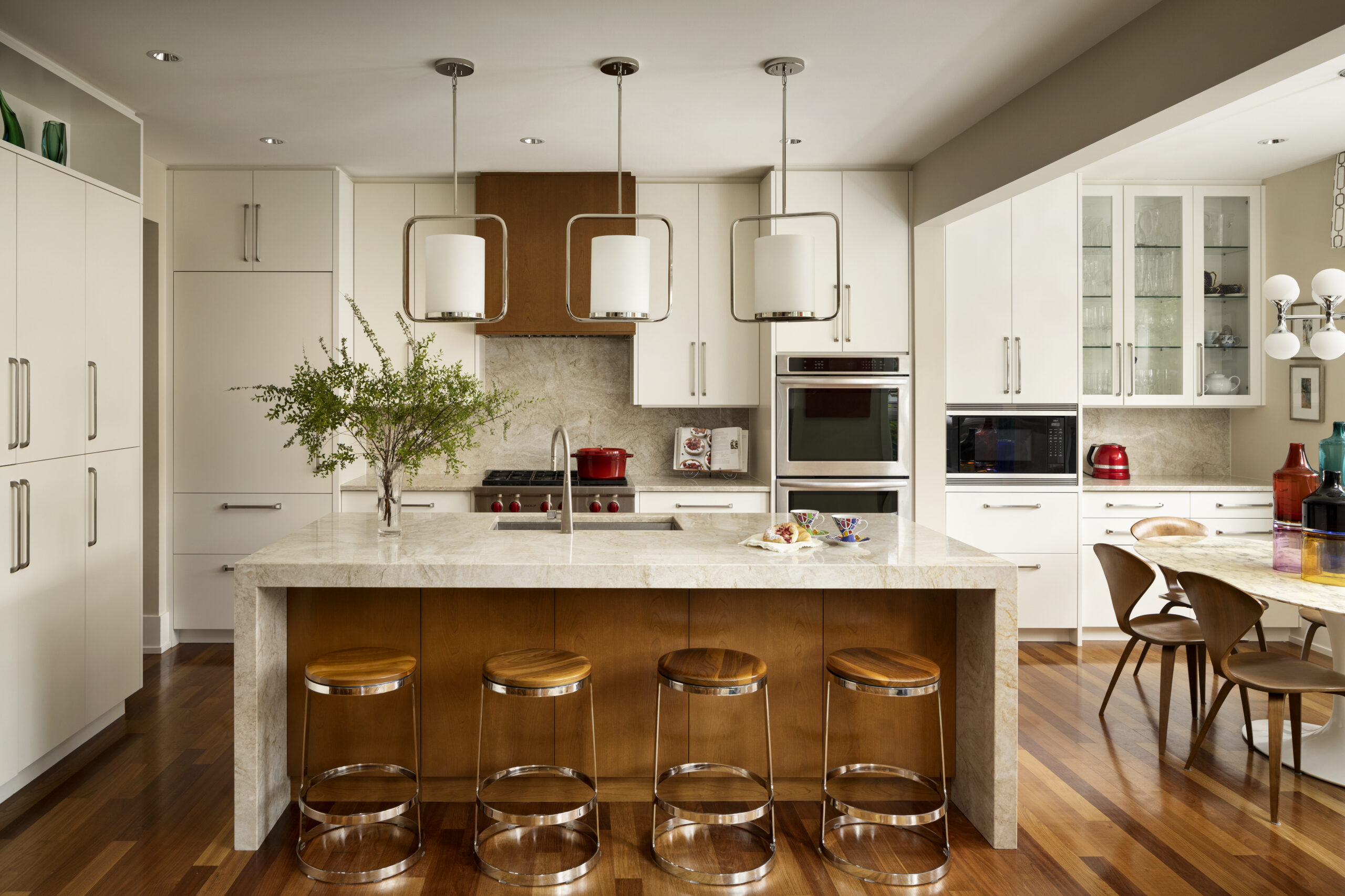
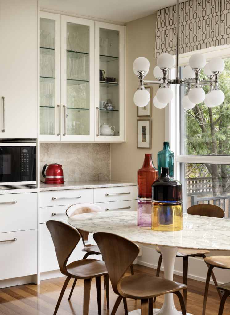
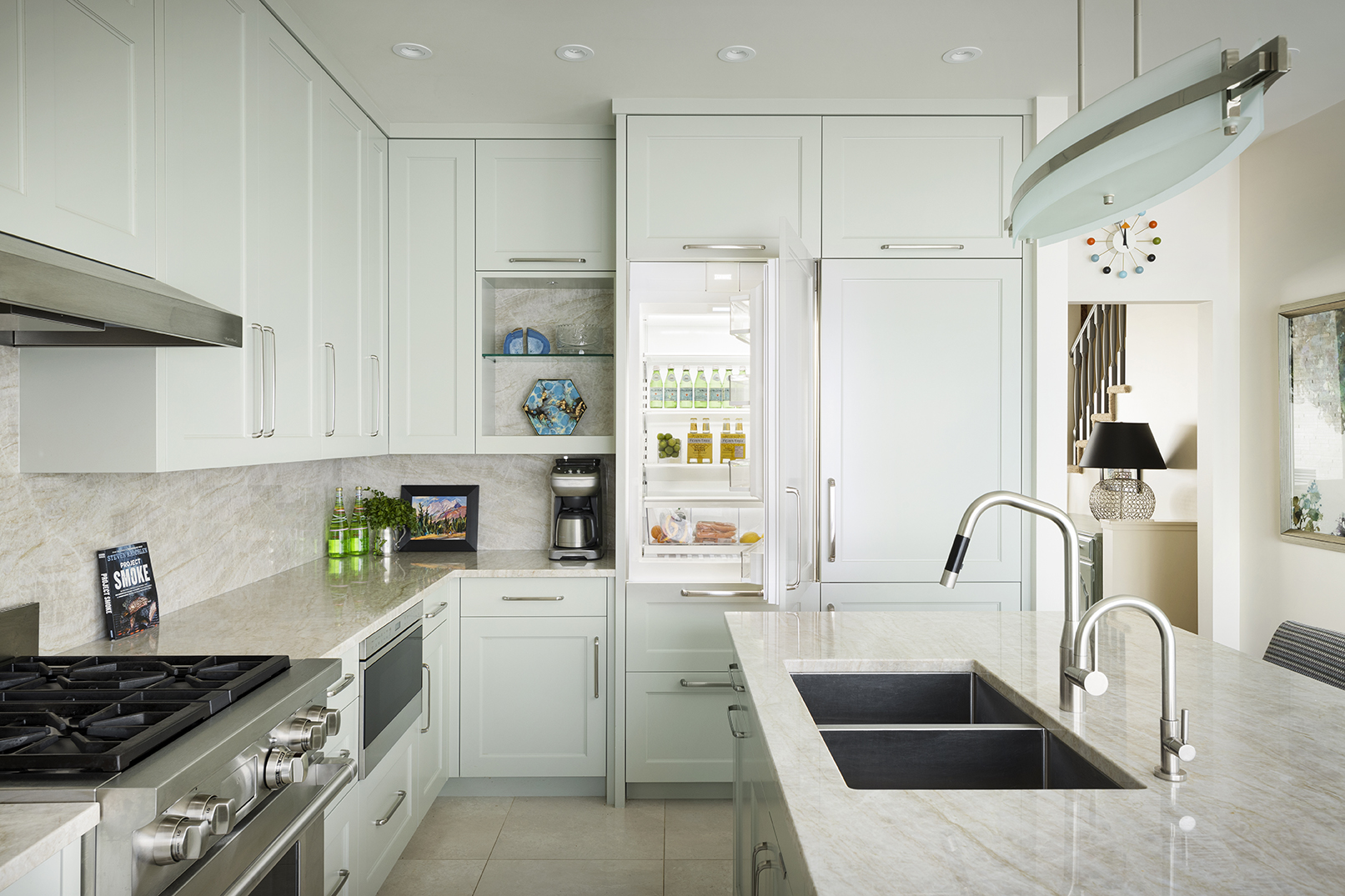
This kitchen was renovated for a busy family of 6. Including their pooch.The counter tops and backsplash boast a natural stone, rich with creams and bronze veining, which enhanced the warmth of the existing wood flooring. The crisp white cabinets brighten the room and provide a contrast to the wood floors.
Lengthening the island provided more storage space, more space for food preparation, informal dining with friends and family, and most importantly, serves as a daily gathering place.
Sculptural large scale pendant lights were installed over the island and another light fixture over the table, providing both drama and brightness.
Voila! My client now has a warm and welcoming fully functional kitchen.
kelvin grove
This was a super fun project to work on: my client loves colour and was not afraid to show it.
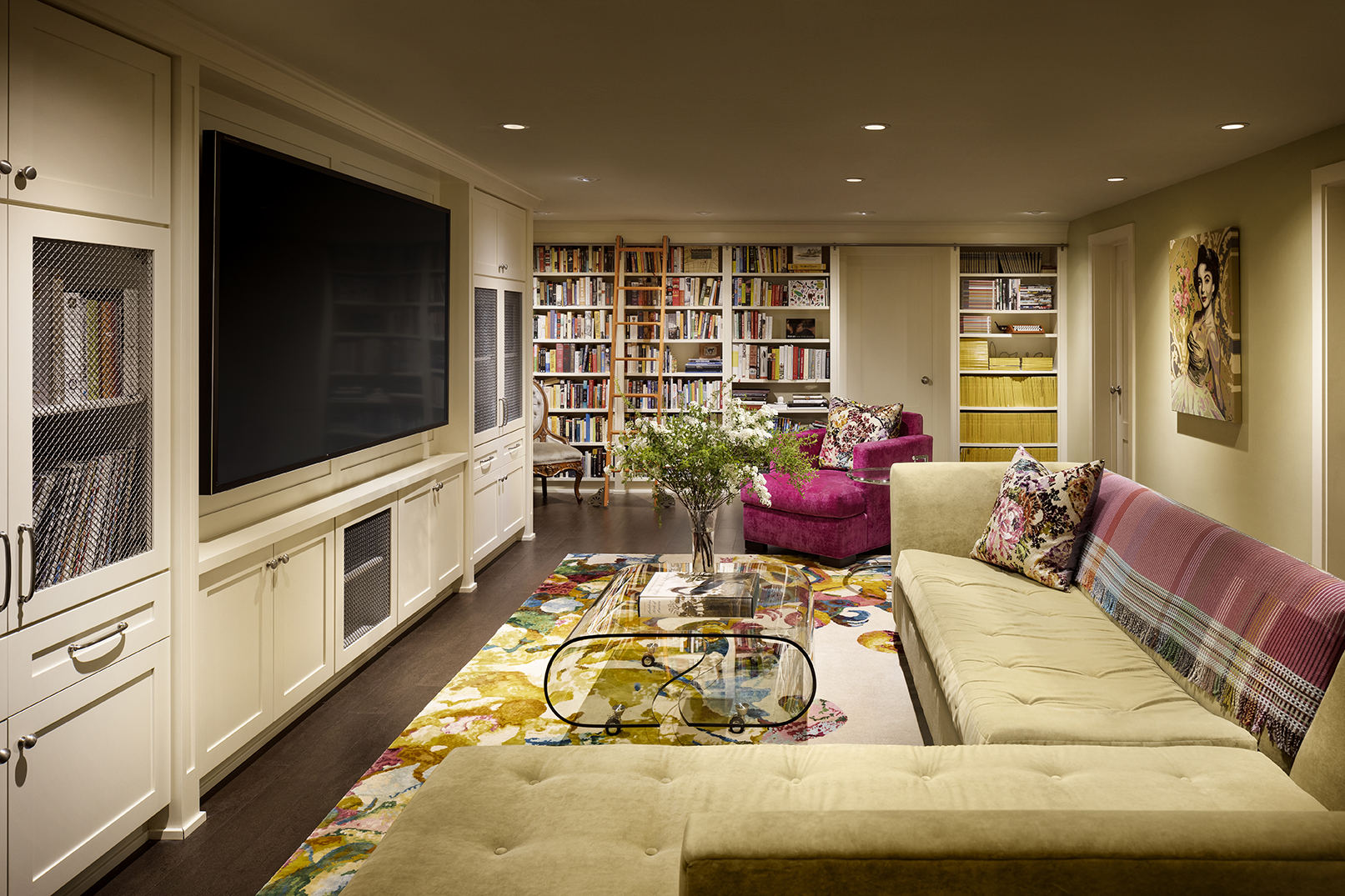
Since the media room was in the lower level of their home with no natural light, it was imperative to create a bright and inviting space. Cork flooring was selected to provide a soft, warm feel underfoot, and the dark brown grounded the space. I selected the vibrant multi-coloured wool and silk area rug as the foundation for all the colours in the room: the arm chair upholstered in bright pink, the custom library ladder painted tangerine, the existing sectional in honeydew, and the collection of yellow National Geographic magazines. It is a riot of colour that melds seamlessly, creating an unexpectedly bright, light space. What you don’t see in this photo are the other rooms I designed, including the wine cellar, working office with crafts area, walk in closet for riding gear and seasonal clothes, exercise area, and laundry rooms. The media room is the main hub and all other rooms flow from there.
As for the practical elements, I designed the floor to ceiling library shelves for their impressive selection of books, and media cabinets to house the flat screen TV, LPs, and turn table as well as the required electronic systems.
The curved glass table on castors was selected so the carpet could be seen through the table, and the background of the painting of Liz Taylor has a similar floral theme alluded to in the carpet, the final finishing touches.
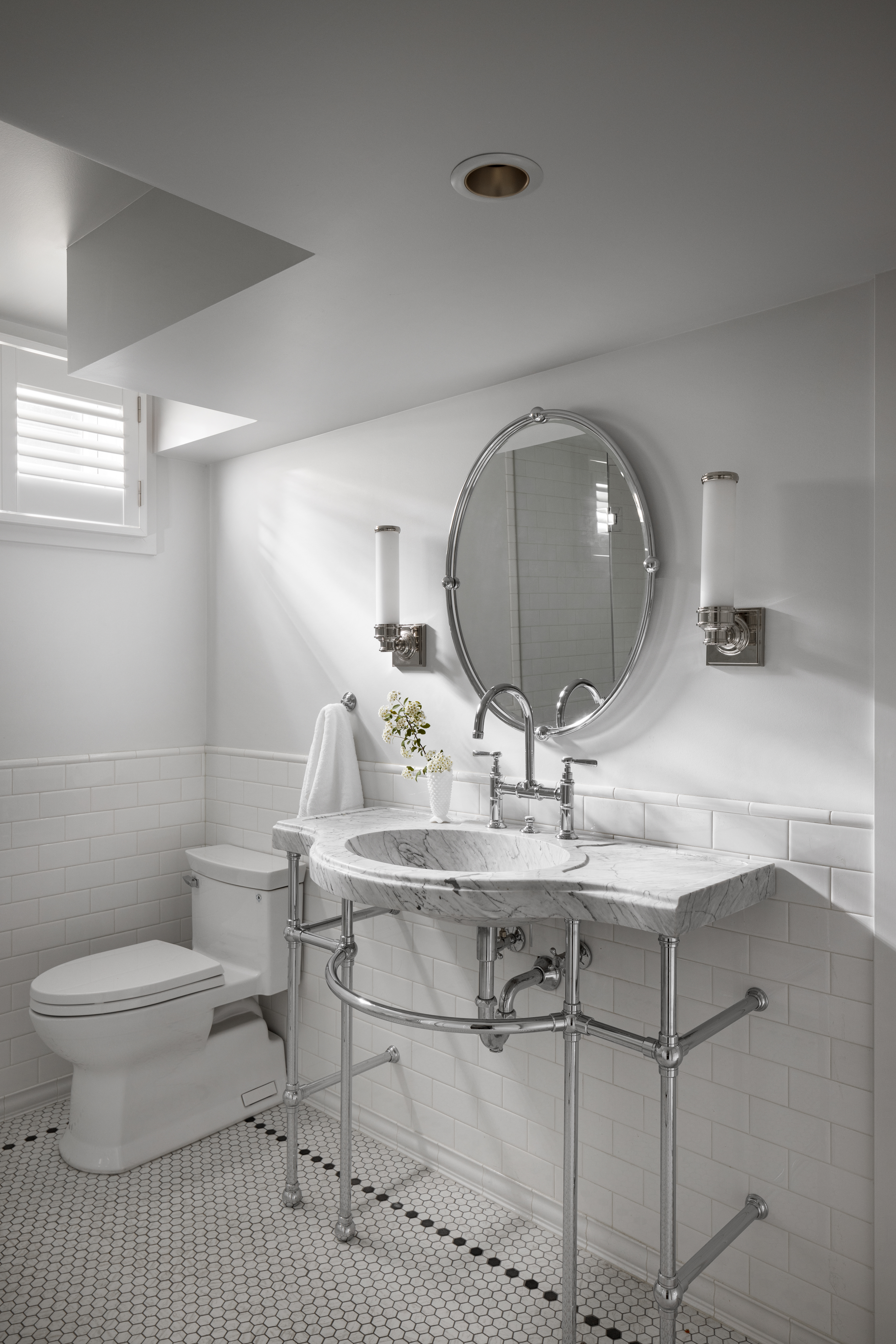
Responding to my client’s request, this bathroom is reminiscent of a hotel guest bath from the 1920s. The black and white hexagonal mosaic tile on the floor was the starting point. I then used white subway tile for the wainscotting, complete with base and trim.
The piece de resistance is the stunning sink made out of one solid piece of marble supported by a polished chrome base with exposed plumbing.
The classic look was emphasized by using polished chrome lever taps, a goose neck faucet with bridge, mirror, and wall sconces.
Garrison woods II
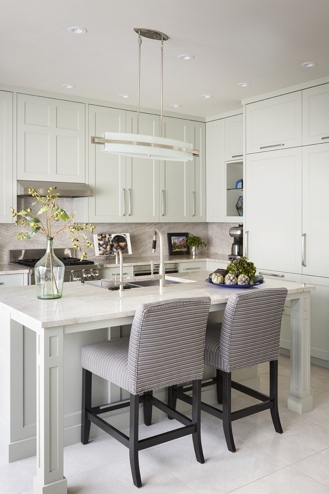
With entertaining being high on the clients’ priority list, their kitchen needed to be the place where guests would gravitate, gather around the island enjoying cocktails and conversation as they watched their meal being prepared. The main challenge is that the kitchen is quite intimate so much of my work was behind the surfaces, maximizing storage for all things kitchen; dishes, pots and pans, utensils, food and much more. Everything had to have its place and be easily accessed, and had to accommodate two cooks at the same time, as the clients like to prepare meals together. It was essential then that this kitchen had to be practical, functional, and welcoming.
To infuse colour into the space, without being too bold, the cabinets and island were painted a subtle green. The counter top stone was also used on the backsplash giving the appearance of a more spacious, cleaner look. The upper cabinets were carried up to the ceiling providing more storage and giving the illusion of a higher ceiling.
At the end of the day, we checked all the boxes, addressing the aesthetics, using a soft colour palette, a variety of textures, finishes, and patterns to create this beautiful nuanced and practical kitchen.


")
")
")